Sponsored by: TeamAlfy
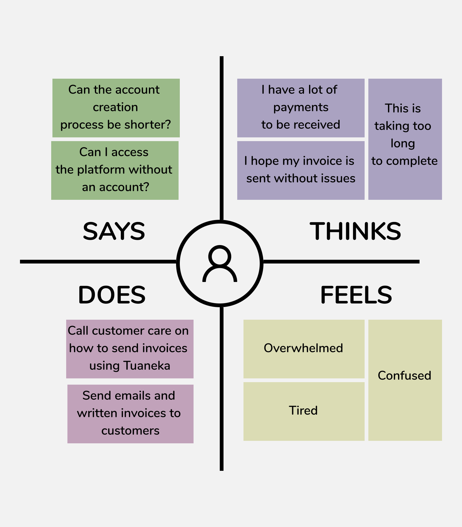
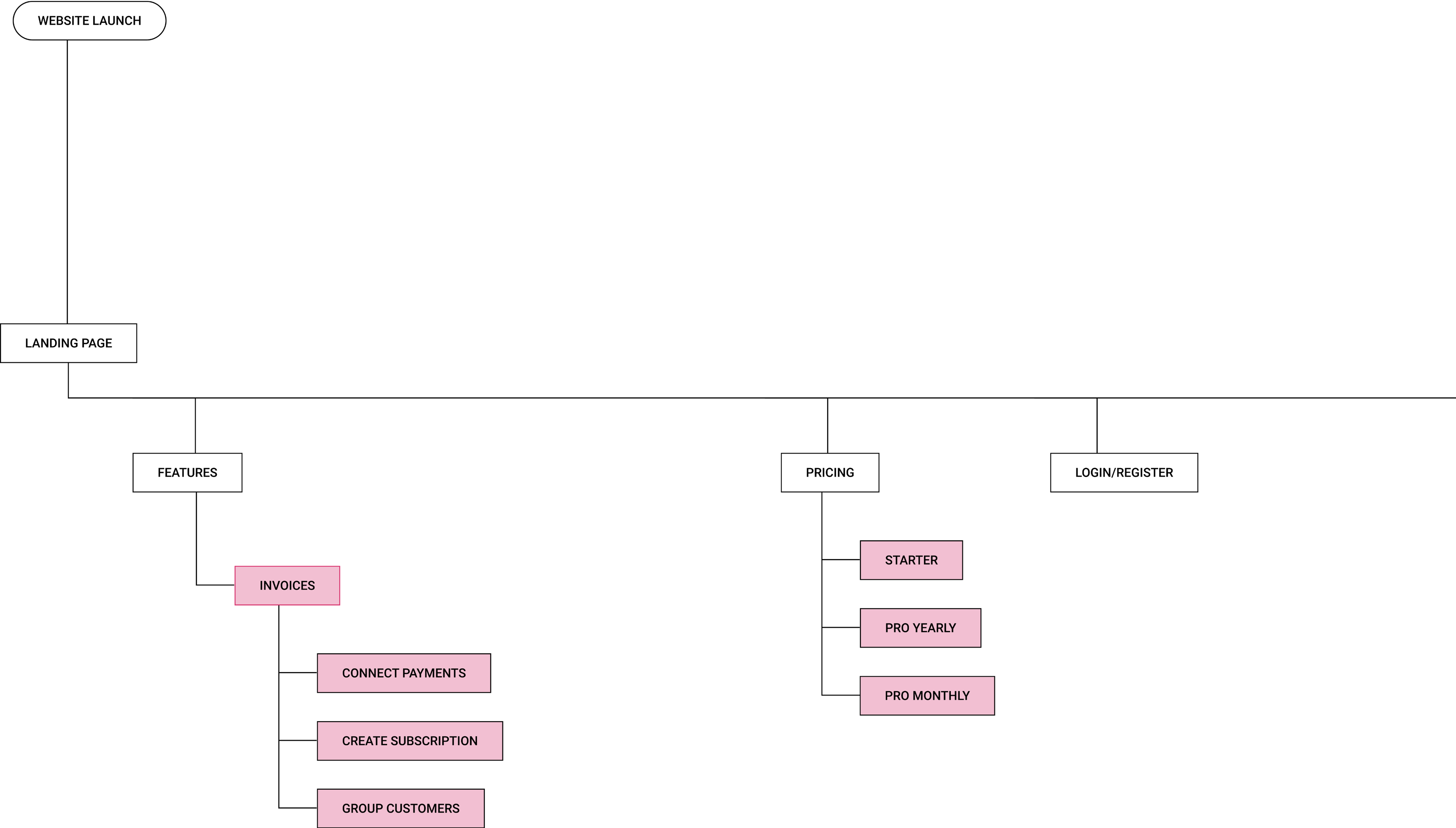
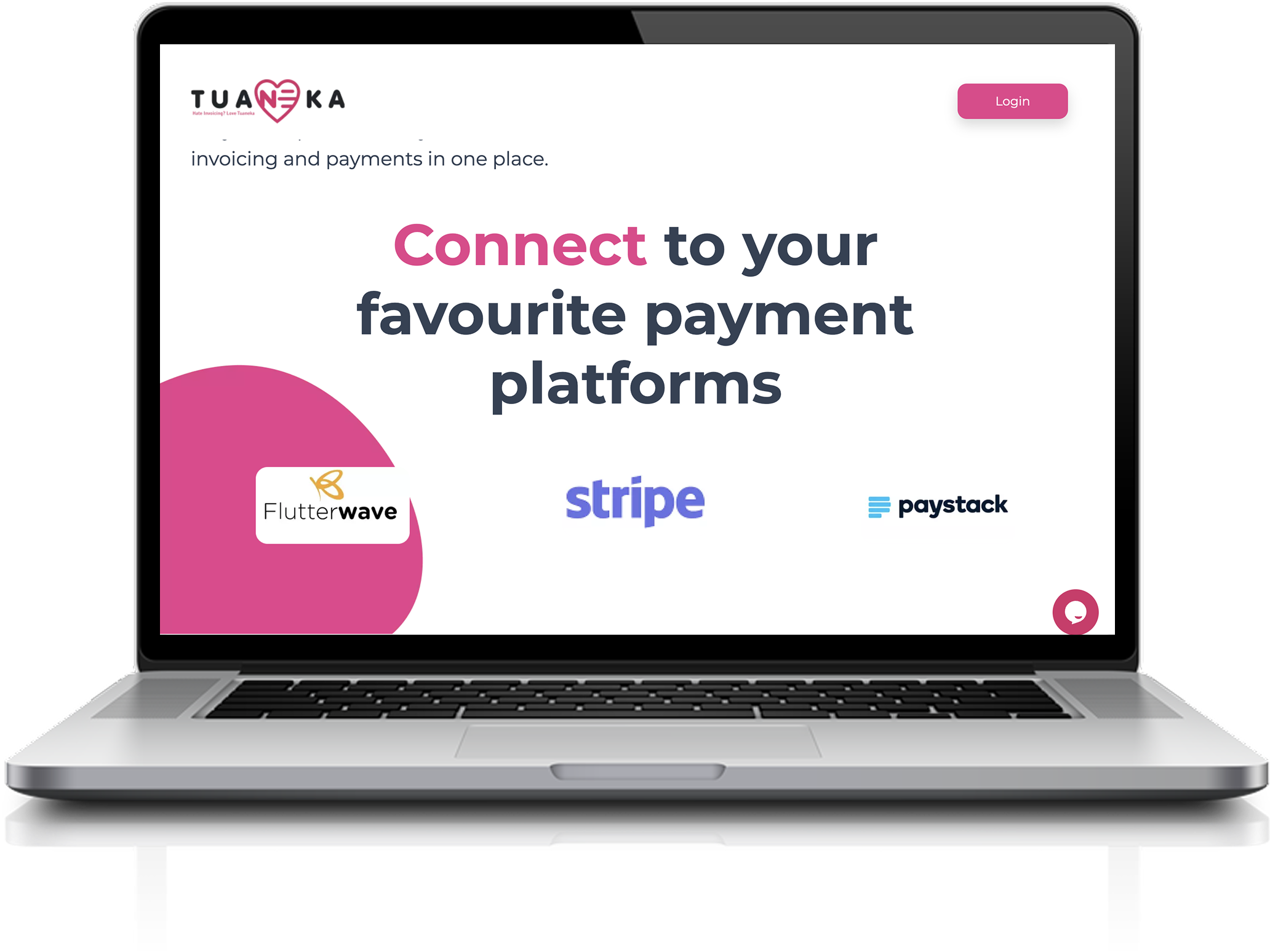
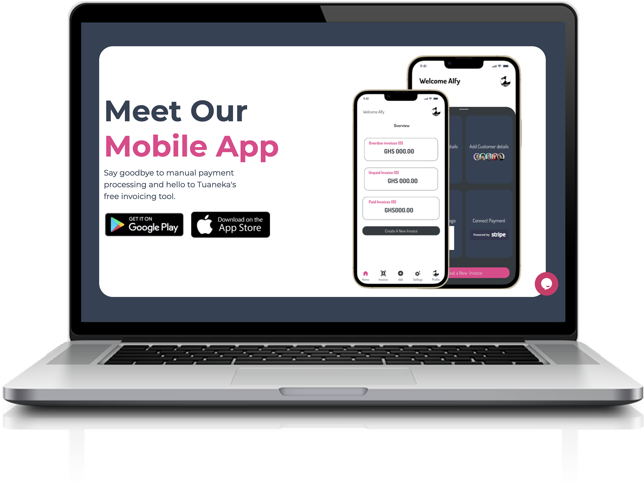
Tuaneka is a free SAAS invoicing tool that allows businesses to create professional invoices in seconds. Users can also create recurring invoices and bulk invoices for large groups.
*To comply with NDA, some details in this case study have been modified or omitted. The content reflects my own work and views, not necessarily those of TeamAlfy. Linked materials may point to evolving live products or prototypes by TeamAlfy.*
Hi-fi Mockups, UX Research, UX Design.
3 weeks
Dora Opare
Balsamiq, Figma
After investigating we discovered that:
Not many of the Tuaneka users fully understand how the platform works and are not able to send invoice or receive payments from clients after signing up on the platform. Being a business with more than 1000 users around Africa, they were directing and redirecting the user from sending invoices to receiving payments, creating loops that generated low platform usage due to the confusion and frustration of the initial website experience.
The main goals of the redesign of the Tuaneka website was to improve site navigation and accessibility to information,
increase plan pricing, and incorporate video demos on the platform
-The major constraint was that, my designs had to be technically feasible with the
use of Tuaneka’s API because the APIs were built before desgin.
- The project had to be completed within 1 agile sprint (2 weeks) after which a week was used for conducting usablity tests.
- How do businesses and individuals send invoices and receive payments on services rendered and products sold?
- Why do you think Tuaneka needs a new or re-designed website?
- How do you want people to FEEL upon seeing your website?
I conducted interviews with the users to understand how they felt about Tuaneka. Based on their feedback, I created an empathy map of the current system, and several user-goals and flows of the future one.
From the empathy map, it is clear that the current way of displaying information on
Tuaneka is not efficient especially when sending invoices and receiving payments.
We had a session with the Tuaneka team to see how they felt about their site, what problems they were having, know more about their business and what was important to them.
I decided to brainstorm other solutions to see which was actually the best. I came up with a pros and cons list for each solution. Two major factors contributed to my choice: Feasibility and Productivity (making sure that we actually achieve the “efficiency” user goal)
I decided that imagery and descriptions were indeed the best solution for the problem because the pros outweighed the cons. Next, I decided to come up with flows and goals for the interface.
As a user, i want to understand the Tuaneka features and usefulness before creating an account.
As a user, i want to be able to see the Tuaneka pricing plans before creating an account
As a user, i want to be able to login to my account or create one seamlessly
The old website was a simple landing page with a carousel highlighting the features of Tuaneka.
I drafted an IA based on feedback for the new High Fi Mockups.
After testing the new interface with users, they all gave positive feedback and verified that with this, they are able to find information on the platform without reaching out to customer care. It was usually time consuming sending messages and waiting for response on the customer care team but with the new update, most information can be directly accessed on the page.
This project taught me that often times, you have to look beyond the screen interactions,
to get the full picture of the user experience.
Next call of action is to focus on how to enhance and shorten the account creation journey as we got
feedback from the interviews conducted